Contrast:

(Kristendigitalrhetoric1102, 2016)
|
Contrast is used to highlight something and show visual importance. It provokes attention. Shapes are contrasted by showing smoothness, complex outlines, and simplicity. Colour can also be contrasted. The darker the shape the more attention the object attracts. Contrast can also be applied to type or letters (David, 2016). The contrast between colours is often more important than the colours themselves. For instance, consider the yellow McDonald’s arches on a red background (Colbow, 2015).
|
Additional Resource Links:

|

|

|
Balance:

Balance is about determining the placement of an element. It pertains to the relationship within a layout, between logo, text, photographs, or illustrations (Farley, 2009).
Additional Resource Links:

|

|
Scale:

|
Scale "refers to the size of an object (a whole) in relationship to another object (another whole). In art the size relationship between an object and the human body is significant" (Lamp, 2016).
|
Additional Resource Links:

|

|
|
Harmony:
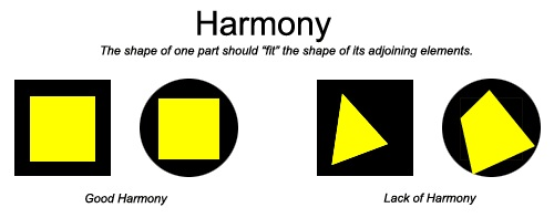
Harmony means all the parts of the visual image relate to and complement each other. Harmony is the combination of elements in a creation and the cohesiveness of the various elements, while still being complementary.
Additional Resource Links:
|

|

|
Emphasis:

Emphasis is "an area or object within the artwork that draws attention and becomes a focal point" (Lamp, 2016).
Additional Resource Links:

|

|

|
Pattern:

Pattern "is an underlying structure that organizes surfaces or structures in a consistent, regular manner. Pattern can be described as a repeating unit of shape or form, but it can also be thought of as the 'skeleton' that organizes the parts of a composition" (Jirousek, 1995).
Additional Resource Links:

|

|

|
